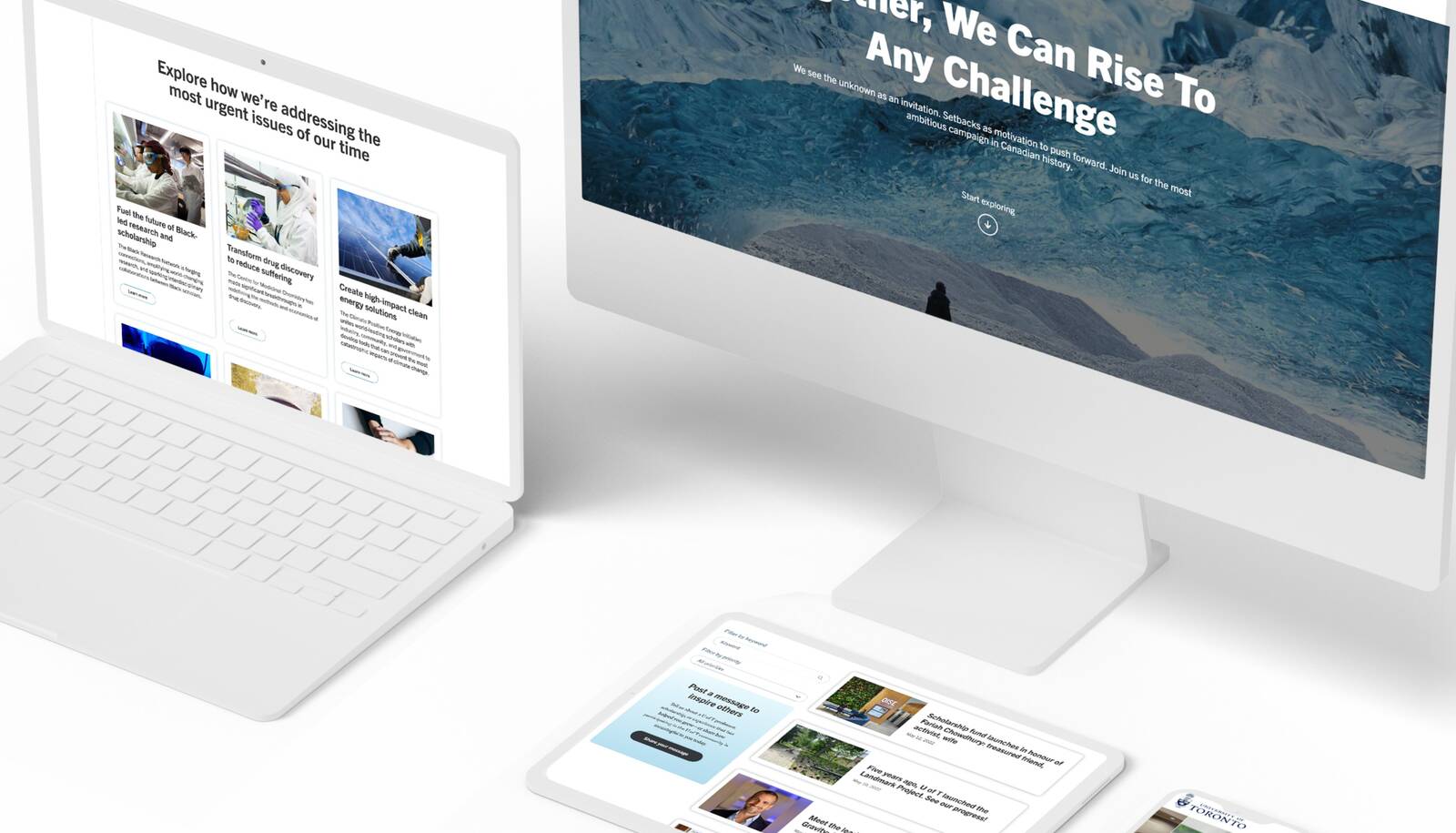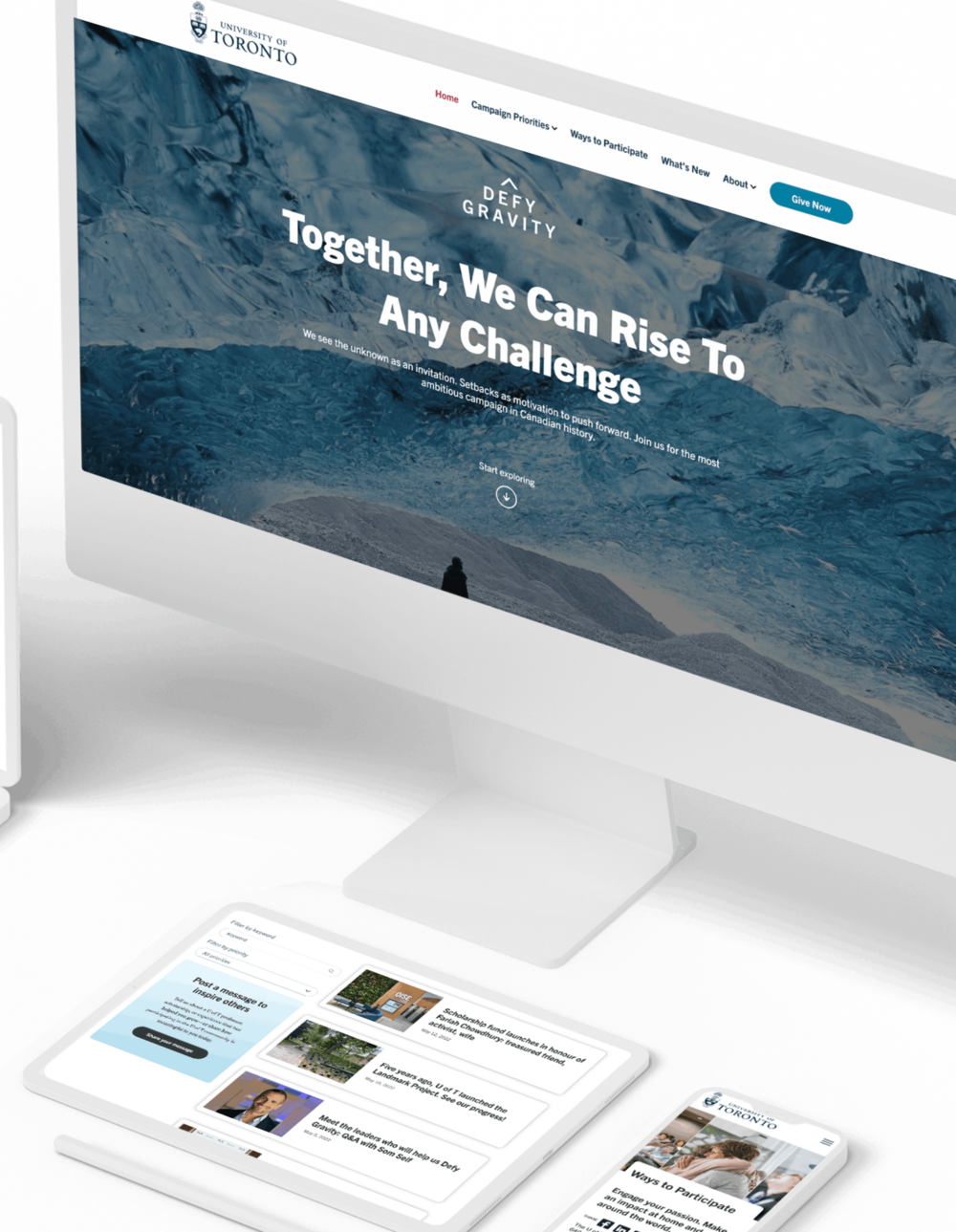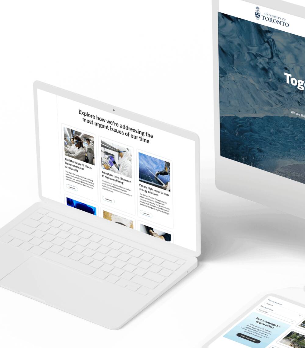
When the University of Toronto’s Advancement team wanted to redesign a historic campaign, they chose Foster
Background
After drawing a years-long, staggeringly successful fundraising effort to a close, the University of Toronto asked Foster to help launch its new “Defy Gravity” campaign. The challenge was significant, but Foster embraced it—and exceeded expectations.
In 2011, the University of Toronto launched what would go on to be the most successful fundraising and alumni engagement campaign in Canadian history. Over the course of a decade, the “Boundless” campaign saw more than 104,000 donors from more than 100 countries give over $2.6 billion.
“Boundless” campaign saw more than 104,000 donors from more than 100 countries give over $2.6 billion.
The Challenge
For ten years, Boundless helped raise the University’s profile by telling impactful stories, sharing news and announcements, and supporting advancement teams in all their fundraising efforts. But after such a long time, U of T felt the campaign had reached its natural end.
But how do you follow up on the most successful philanthropic effort in Canadian history? The University started by rebranding the campaign with a global advertising agency—and developing a new flagship website with Foster Interactive.
From the RFP Invitation to Quote:
"The campaign website will serve as the foundational digital hub for the new campaign and will play an important role in supporting the University's prospecting, cultivation, stewardship, and broader community engagement efforts."

The Solution
In working with the ad agency, the University developed a new brand platform and a new name—“Defy Gravity.” And when they were ready to execute on that positioning, we were prepared.
Planning for the build was split into three broad areas.
Information Architecture
First came a combination of the technical planning for the build and designing the site’s navigation and structure.
The University’s web team had significant experience with WordPress, so we already knew we’d be building on that platform. But we still needed to spend considerable time defining the new site’s content strategy and information architecture.
Why? Out of the ad agency’s work had come a new way to think about how to attract donors. The University’s Advancement Division had learned that people don’t simply want to write a cheque—they want to engage with the University on a drilled-down “micro” level. (For example, one person might wish to help build a university residence; another might want to earmark their donation for indigenous women’s studies.) The strategy became one of sharing emotional, compelling stories about how donations make a difference in real people’s lives—to help donors invest in outcomes that U of T facilitated.
However, this new granularity around donations led to approximately 800 different funds to which donors could give.
The University categorized the funds into seven campaign priorities:
- Support Student Success
- Create a Sustainable Future
- Build Inclusive Cities and Societies
- Enable Healthy Lives
- Drive Scientific Discovery
- Spark Creativity and Culture
- Power Innovation and Entrepreneurship
These “buckets” provided the backbone of the site’s navigation and served as both the central organizing scheme and the framework of the campaign.
Initially, the groupings were more abstract than they could have been. So we did four rounds of A/B testing to see what structures and labels in the navigation would be most intuitive for alumni and donors. Those extensive tests helped us solidify the themes and sub-themes in the new site’s navigation menu.
"In working with the ad agency, the University developed a new brand platform and a new name"Defy Gravity
Visual Design
Concurrently, we started planning the content itself, focusing on storytelling instead of simple “fact-presenting.” After all, the goal was to help donors engage with the outcomes the University creates.
We had a hunch (that we tested, of course) that on-the-ground stories of real people would perform better—and lead, in turn, to even more donations.
We also worked quite closely with U of T’s content teams on getting the words written. First, we created wireframes and content templates, then helped their content teams create pages to those specifications, and then iterated on designs as the finalized content came together.
Finally, we began planning and iterating on the design, going from rough concepts to a finished presentation in a remarkably short time. This also happened at nearly the same time as the other planning phases.
Complicating matters was the fact that the University was still developing and refining the site’s visual identity after we had started working on the website. So we spent time helping U of T bring their ideas to life— doing art direction, exploring ideas, introducing fonts and colours, and refining and iterating our designs until we achieved what’s on the site today.

The Foster Difference
Working through project approvals was a highly complex task, but we adapted well to changing needs. The University adapted, too, responding positively to design and execution elements that we felt heightened and extended this flagship execution of their brand platform.
And when the site launched on December 15, 2021, we had done it—together, Foster and the U of T had brought “Defy Gravity” into the world.
We’ve worked with the Division of Advancement for several years, which means they’ve come to trust us as team members. There’s no doubt that closeness was a direct contributor to the success of this project.
Having an idea of what issues might pop up is invaluable during a website build. It’s what helps us appreciate the complexity that an organization like the University of Toronto faces in their day-to-day work.
It also helps us anticipate problems that senior staff will face as they seek approvals—and head them off before they have the chance derail a project. We plan for this need as a part of our process, and always have contingency plans ready to help cut off significant delays. Few external vendors would be able to anticipate these potential issues, but our extensive experience with both U of T and this team makes it happen.
After all, we work hard with all our clients to establish rapport and trust. And with many of them, we’re lucky enough to help them for years, not just months.
That kind of trust is essential with a complicated build like Defy Gravity—and it’s one of the factors that helped us ensure the site would launch to such success.
"We've worked with the Division of Advancement for several years, which means they've come to trust us as team members."
